
The Exxentric website, redesigned for clarity and purpose.
Project
Exxentric needed a renewed website that clarified the product offering, simplified navigation and strengthened the digital identity. The project focused on reorganizing a large and growing content base and shaping a modern experience that better represents the company while supporting its expanding user groups.
My role
I led the UX & UI direction by defining the structure, core flows and overall visual approach for the redesign. My work focused on turning early insights into clear interaction models and translating them into prototypes that shaped the final concept. Throughout the project, I was responsible for maintaining clarity and ensuring that design decisions consistently moved the product toward a more intuitive and cohesive experience.
Tools
Adobe CC, Wordpress, Google Analytics,
Figma & Miro
Team collaboration
Marketing
IT & Development
Key steakholders
Duration
Long term redesign across multiple quarters
The challenge
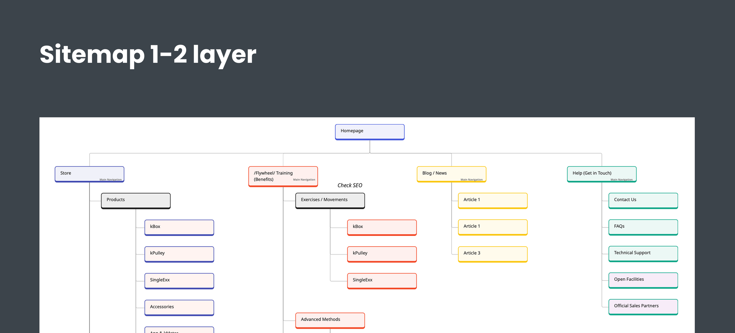
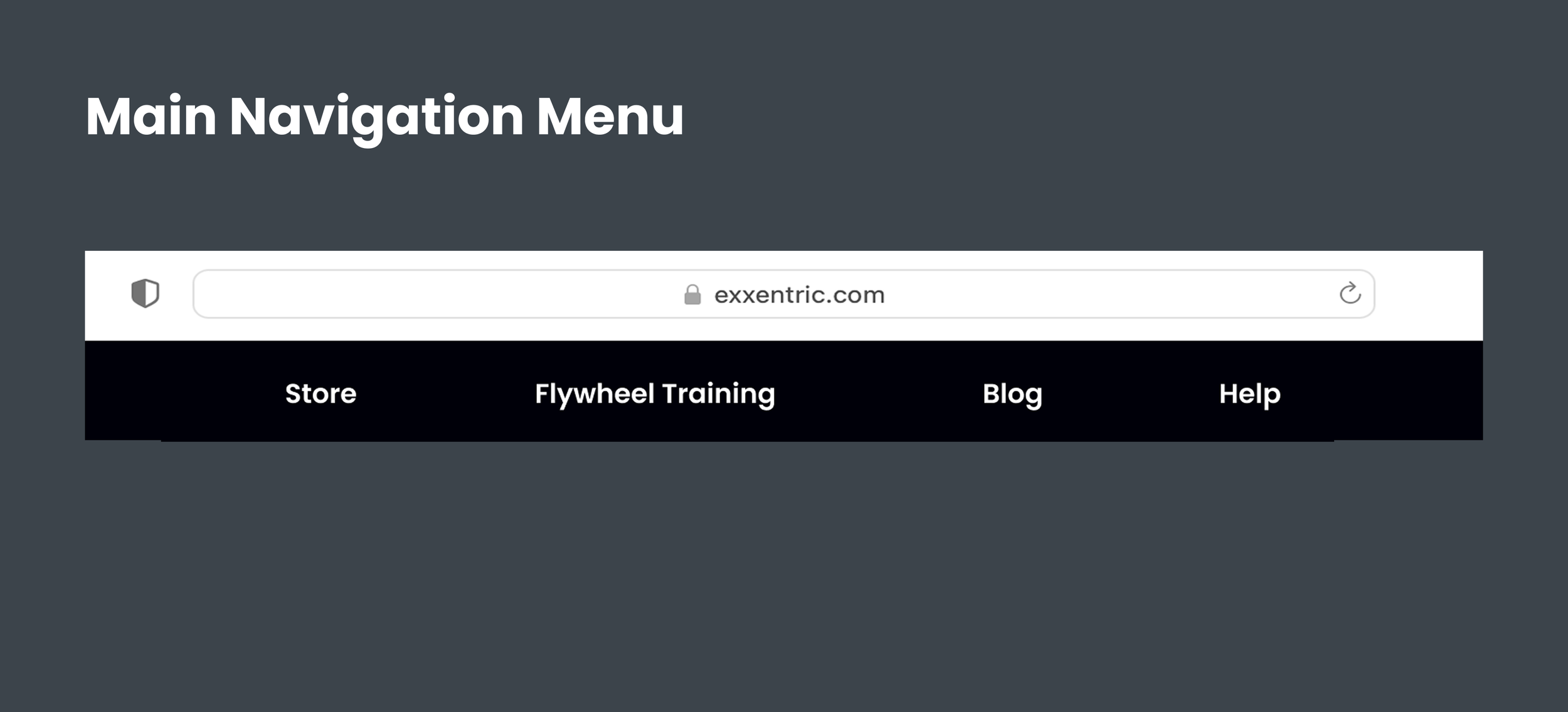
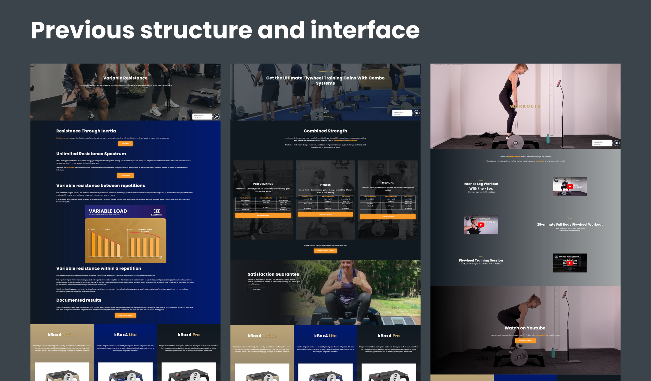
Exxentric’s website had grown into a large and complex structure with unclear navigation, inconsistent visuals and long user paths. New visitors struggled to understand the product offering, while returning users often lost momentum as they moved through the site. The challenge was to reorganize this environment into a clearer and more focused experience that could support different user needs without adding friction.
Process and approach
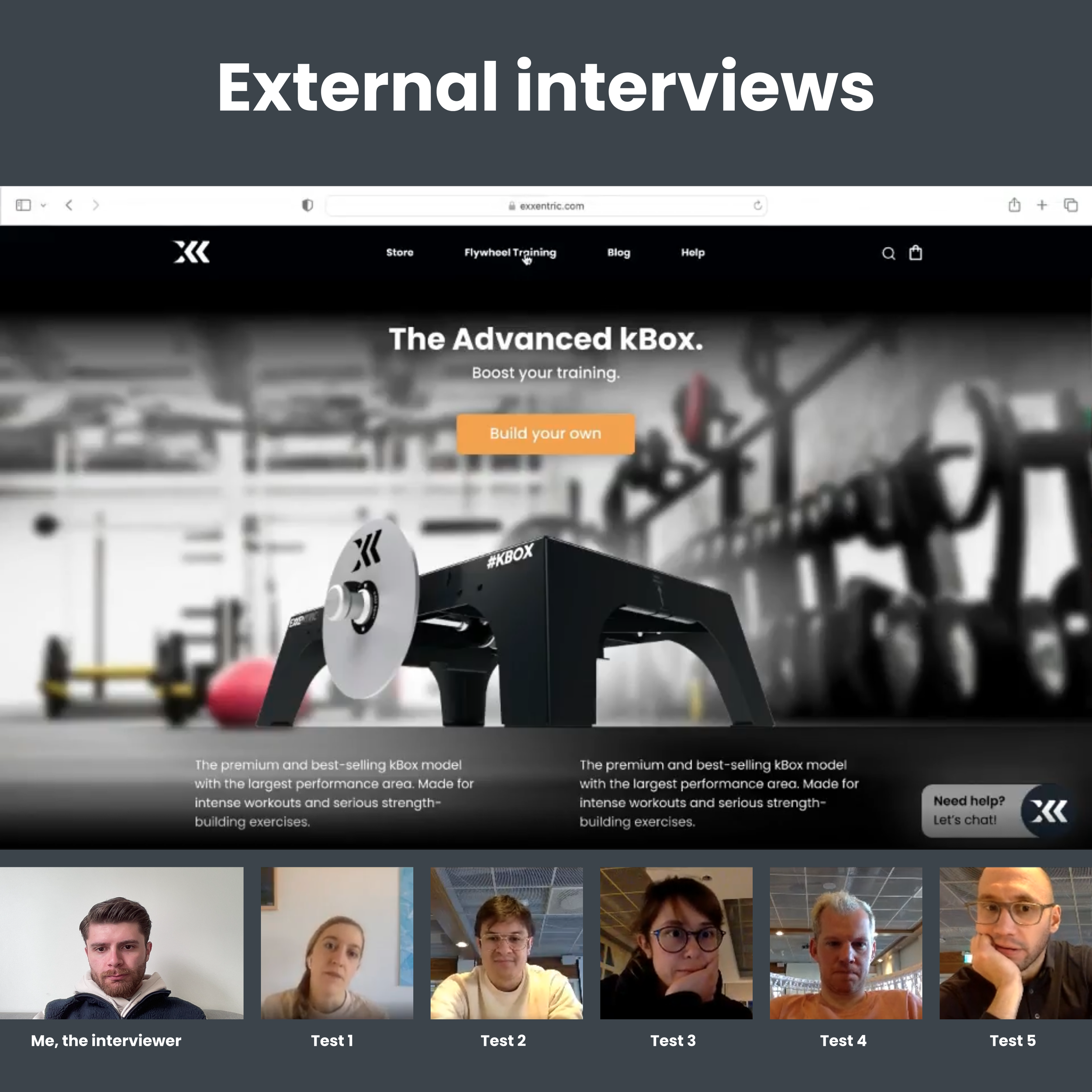
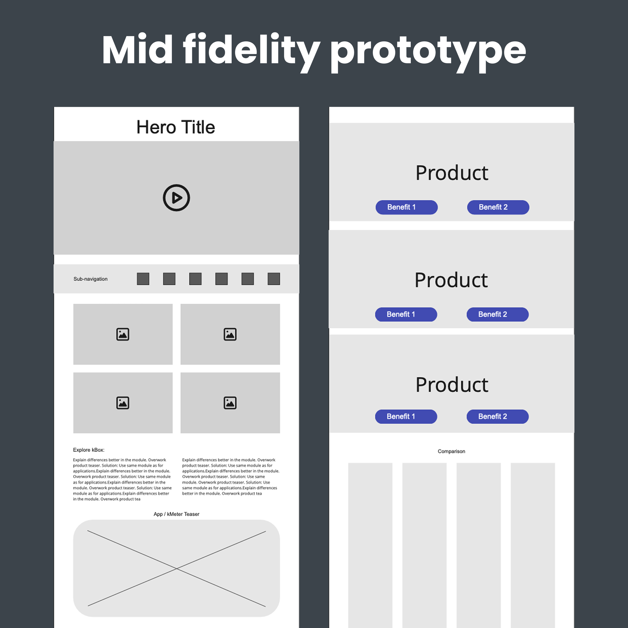
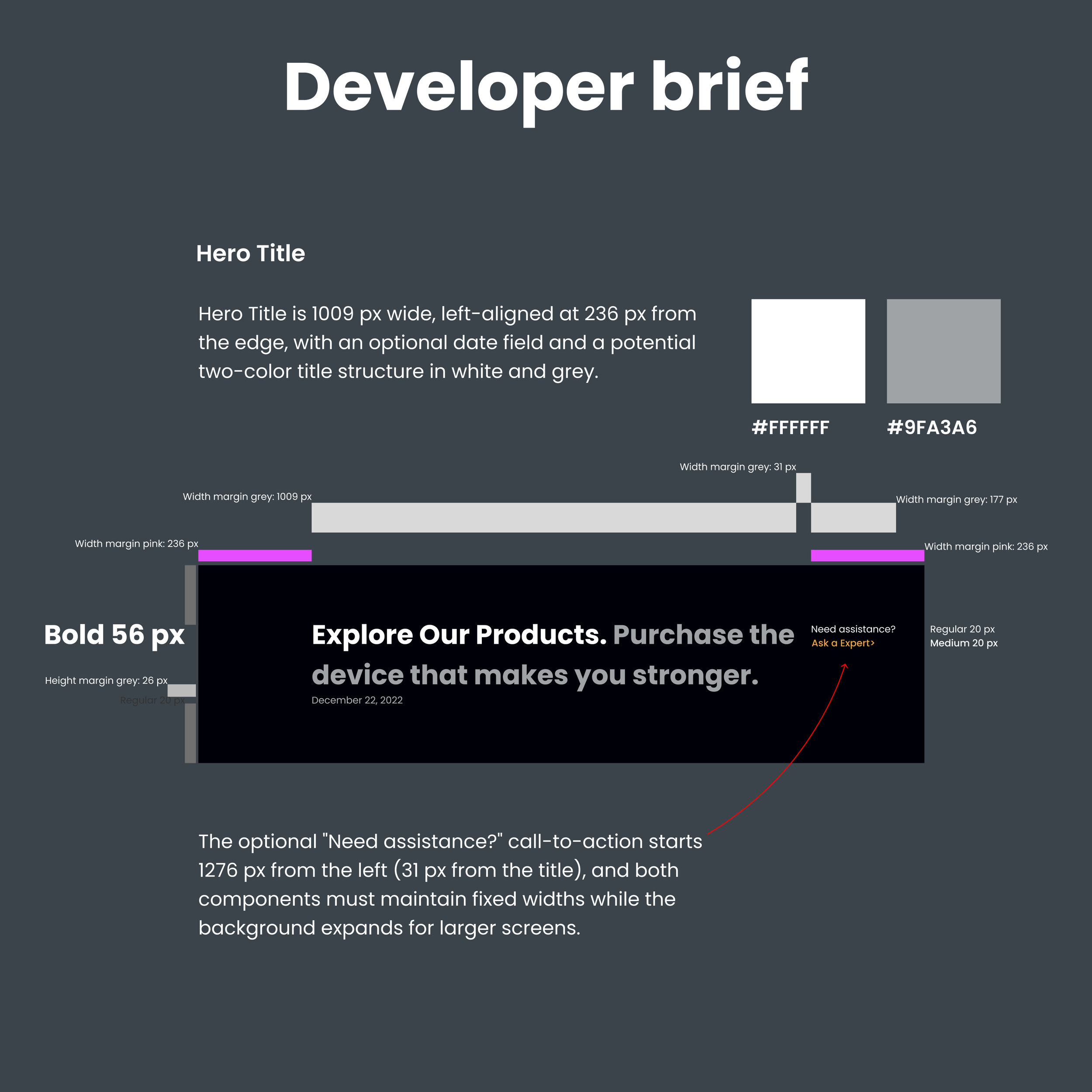
My first step was to map the existing experience and establish a clearer architecture that could support different user needs. Insights from analytics, external interviews, early feedback and internal reviews helped identify where the experience created unnecessary effort. I translated the new direction into prototypes, tested core flows through external user sessions and refined the design through several rounds of feedback. Throughout the process, my focus was to introduce order, remove friction and build a foundation the company could continue to grow on.

Outcome
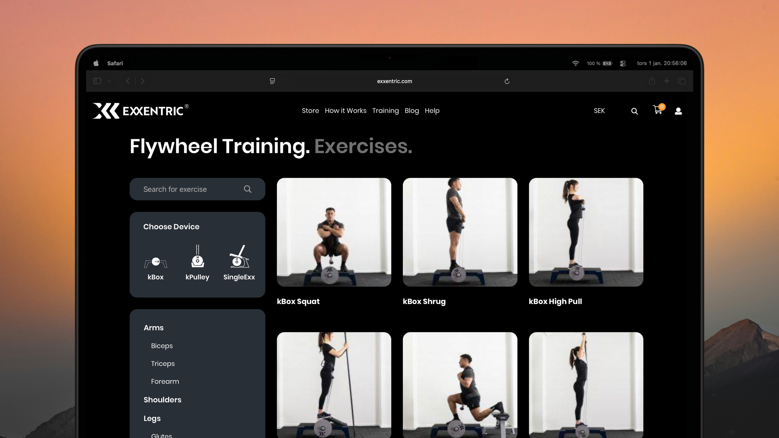
The redesign resulted in a clearer structure, a more intuitive navigation model and a visual direction that feels modern and consistent across the entire website. Key journeys were simplified, product information became easier to understand and the overall interface gained a calmer and more focused rhythm. The new foundation supports both new and returning users and provides a scalable system for future updates.

Impact
The new website brought the organisation closer to a unified product direction by clarifying how users navigate and what information they look for. The improved structure reduced uncertainty for stakeholders and gave developers a clearer path to follow, improving both planning and decision making. The work also strengthened the company’s understanding of UX and helped establish a more focused and long term approach to digital development.
What I learned
Working on a long term and complex redesign strengthened my ability to bring clarity to large systems and guide decisions through structure rather than opinion. I learned how to balance independence with collaboration, and how to communicate design choices in a way that builds trust across teams and stakeholders. The project also reinforced the importance of grounding design decisions in real user behaviour while keeping a long term perspective on scalability and consistency.